Black Widow #8 // Review
Natasha has survived a horrible experience. (It’s okay. She’s used to doing that.) She’s relocated to San Francisco. (It’s okay. She can afford it.) Now she’s on the trail of a mysterious cult leader who surrounds himself with super-powered thugs. (It’s okay. She’s the Marvel Universe’s most formidable super-spy, and she’s clearly on top of the situation in Black Widow #8.) Writer Kelly Thompon continues to explore the life of Natasha Romanoff with the art team of Elena Casagrande and Rafael de Latorre. Elisabetta D’Amico assists with additional inks. Always impressive colorist Jordie Bellaire lends depth, radiance, and shadow to page and panel.
Natasha and Yelena are hanging out and having coffee at a park in San Francisco. Natasha is plagued by memories of motherhood. And since she’s the Black Widow, those memories are really, really complicated. To make matters worse, there’s info that they’re waiting on. Business is tended to. Later that night, they’re off to deal with matters regarding a man named Aldrich Lux Voss, who just might have something to do with the shadowy cult leader known as Apogee. It’s unclear exactly what’s going to happen, but someone is almost certainly going to be thrown out a window.
Thompson continues to expand Natasha’s little world in Marvel’s San Francisco. The script manages a great balancing act between interpersonal drama, cloak-and-dagger mystery, and all-out action. The switches between different modes and moods of storytelling is impressive. Thompson’s grasp of cleverly minimalist dialogue is similarly impressive. This is the story of a woman who is trying to recover from having lost her only child to a lifestyle she couldn’t stop. Still, Thompson manages it with a stylishness that feels a lot more engaging than anything Bond or Bourne would have dealt with over the decades.
The art team brings that stylishness to the page with a sharp, atmospheric visual work. Elena Casagrande, Rafael de Latorre, and Elisabetta D’Amico are clearly bringing San Francisco to the page with a rich sense of detail drawn directly from numerous references. Every panel FEELS different from anything going on in Marvel’s Manhattan right now. Natasha is perfectly framed in low-key heroism that looks epically...subtle. Bellaire’s colors bathe the panels in a richly defined atmosphere. The sharp lines in the hairpin-precision of anatomy and architecture give the visual world of this Black Widow an almost CAD-like quality. It would likely feel really, really antiseptic were it not for Bellaire’s uncanny ability to add nuance and mood to every moment, from an idyllic day in the park to an assault on an office at night.
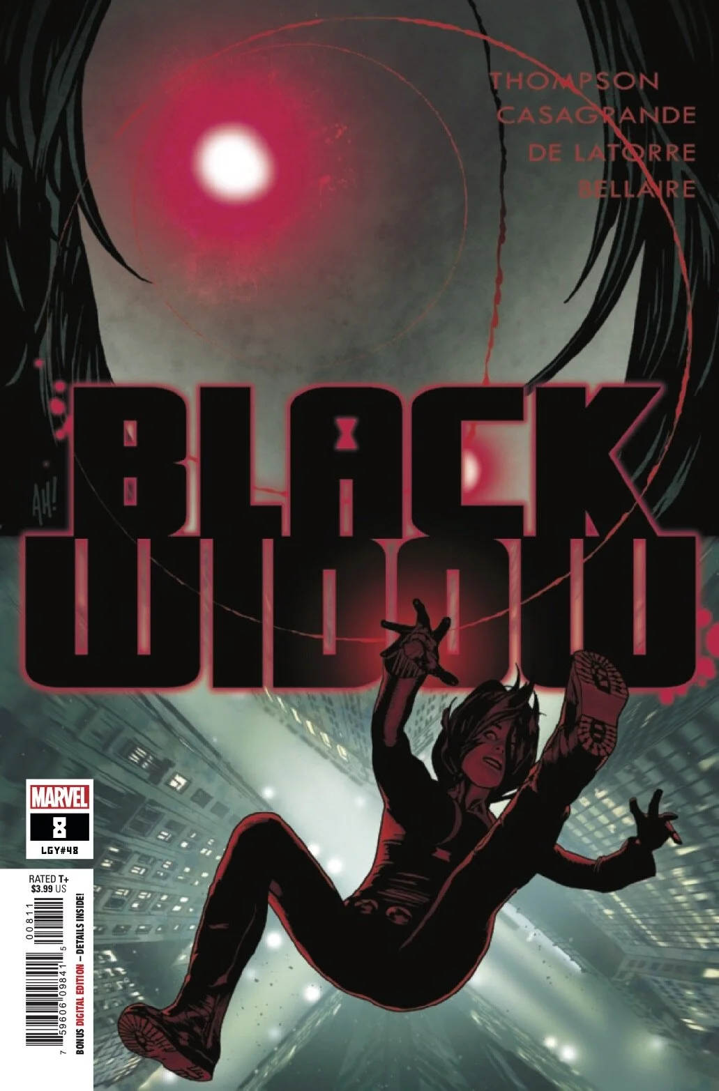
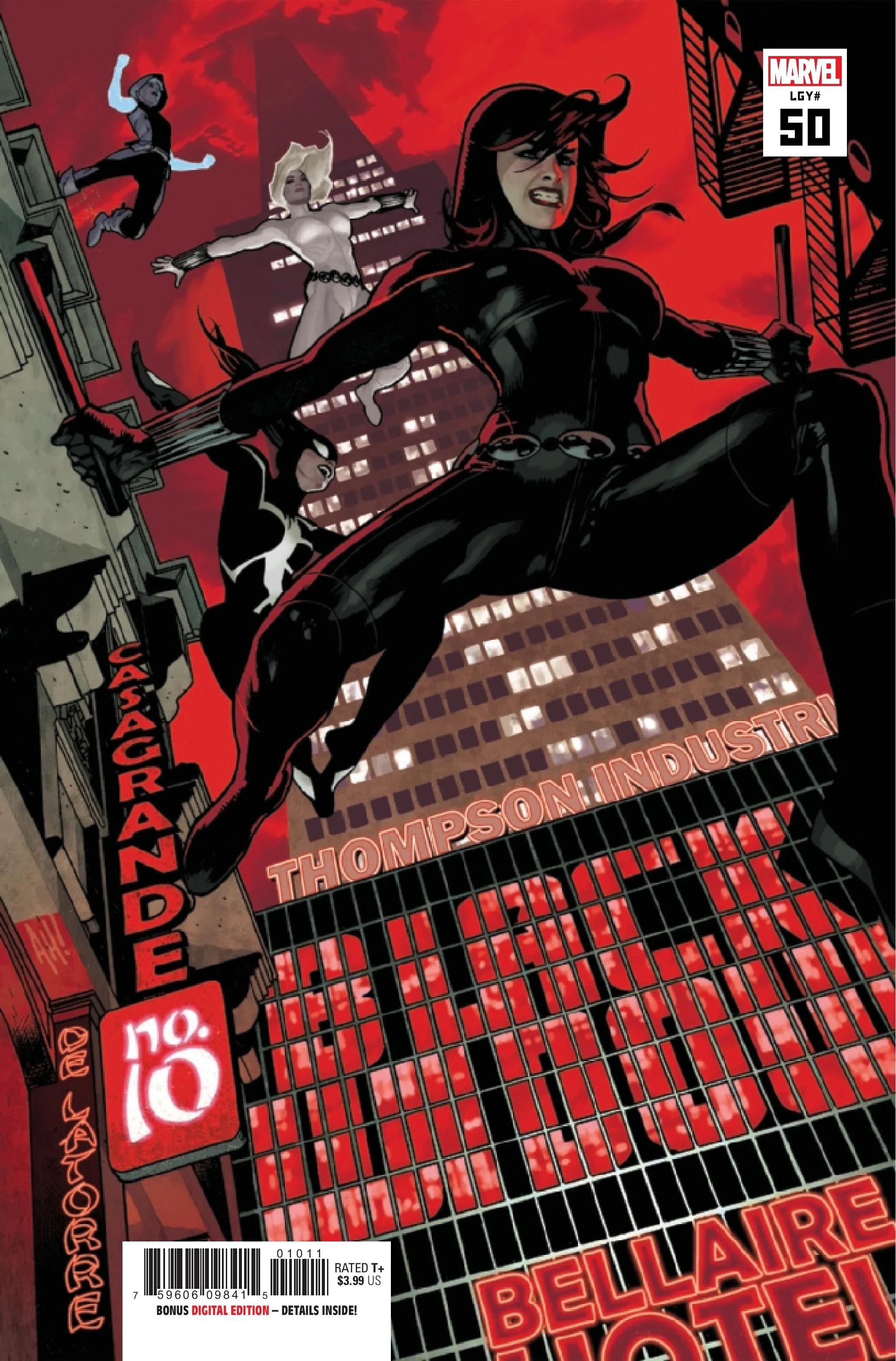
The team on Black Widow is remarkably well-modulated. Everyone’s work on the book seems to sharply support everyone else’s work. A team rarely feels this in synch. Once again, Adam Hughes’ cover artwork serves as an appealing opening to the eighth chapter of what is rapidly asserting itself as one of the most reliably good monthly comics on the rack this year.


