The Vampire Slayer #16 // Review
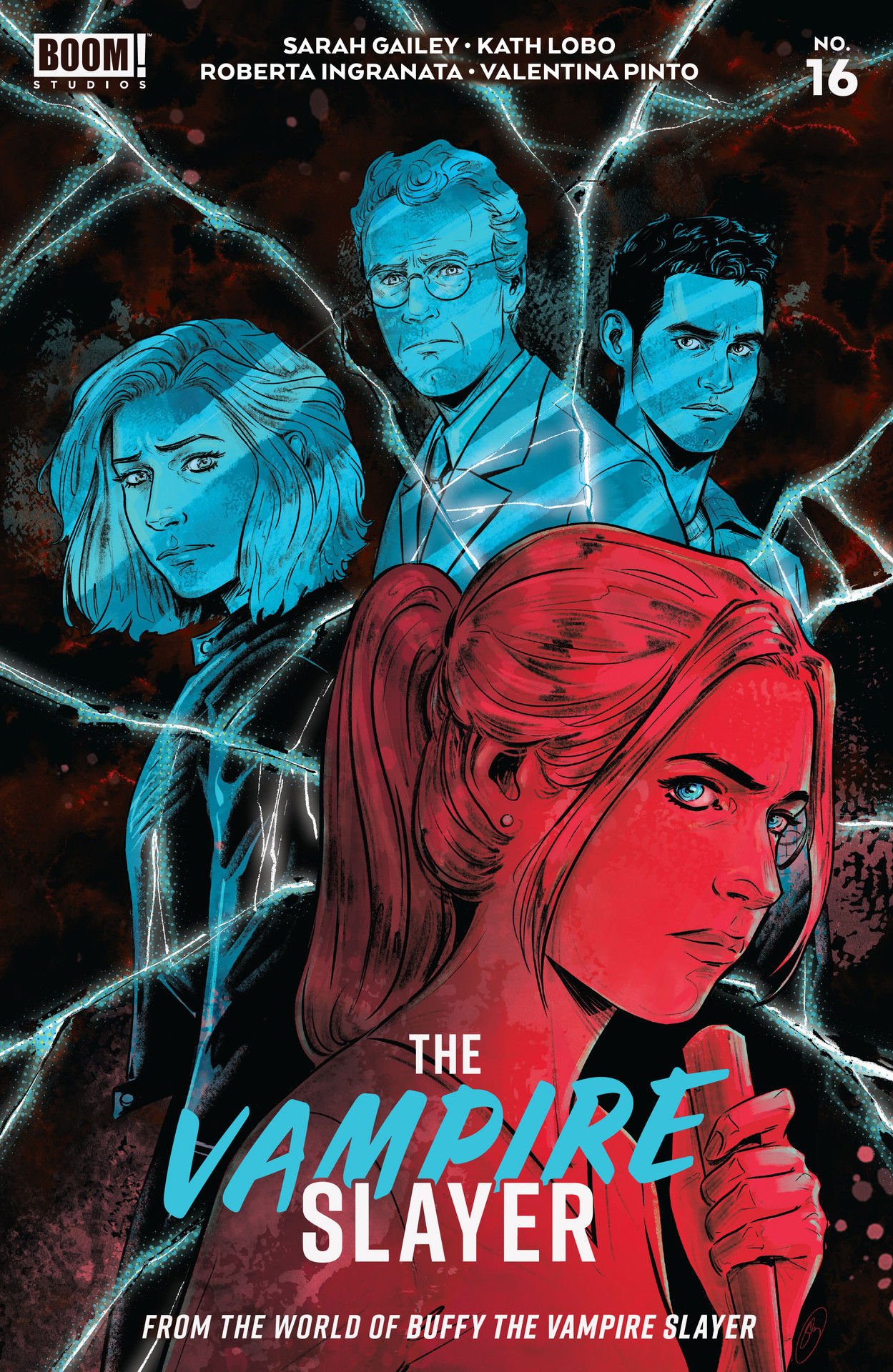
Buffy is yelling at Drusilla, who tells her that her concerns don’t matter so long as she can open a permanent door to Hell. It’s worth noting that as she says this, she’s reading a copy of Calm Your Mind Using Cognitive Diffusion. Welcome to the 16th issue of The Vampire Slayer. Writer Sarah Gailey continues a story with artist Kath Lobo and inkers Lea Caballero and Roberta Ingranata. Color comes to the page courtesy of Valentina Pinto and Riccardo Giardina. Once again, Gailey nails the precise mixture of action, humor, and general snarkiness that are hallmarks of the franchise.
Faith and Willow are tied up in the middle of a weird-looking pentagram. (Seriously. There are like...emojis around it and everything. No circle connecting the points of the star. Who does that?) Drusilla also has Baby Crab’s pincers shackled, so it’s not exactly doing all that well, either. It’s really one big mess, and Buffy is going to literally need to get out of her cage to deal with it all. There are other people around who might help, but at least a couple of them are tied up right now in the middle of a weird-looking pentagram as Drusilla tries to open a portal to Hell.
Gailey narrowly focuses the issue on a single encounter. It's just one scene, but it's a lot of fun. Gailey seems to have found a way to get just the right amount of time with everyone in the room, which is actually kind of a huge challenge given how many people are involved and how narrowly the author focuses on a single encounter. Gailey nails the distinct voices of nearly every character in the ensemble in a thoroughly enjoyable, little furtive brush with Hell.
Lobo and company frame the action on the panel and page pretty well. Layouts move along the action in a way that feels fluid and natural. Specific moments might feel a little stiff in places. The actual physical aggression seems to fit the page in awkward ways that don't actually convey a fluid sense of movement. The humor is delivered to the page with some degree of style and form. Lobo’s art style amps up the cuteness of the characters in a way that feels cozy and cuddly.
If it was handled with just a bit more poise and squishiness, it might feel like an Archie-meets-Buffy sort of thing. There's an undeniable appeal about it that feels like a pleasantly strange mutation of the original TV series. It doesn't quite have the same impact, but it does feel like a natural extension of the beloved franchise that fits everything together quite endearingly on the page. It all ends with a bit more cheesiness than most episodes of the TV show, but it’s a nice, cuddly close to an adaptation. And it’s just nice to see an old franchise continue to make its way forward after all these years.


