Thumbs #2 // Review
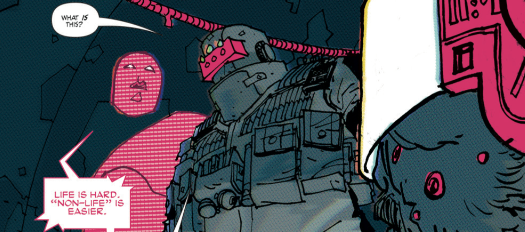
The future is covered in wires and vidscreens. Cables are everywhere and people litter rooms covered in head-mounted video goggles. In the future, “mom” is a red AI who tells people how to interface with the revolution. The future is a dystopia where people have turned back from the selfish narcissism of social media dominated digital reflections and moved towards something that feels eerily totalitarian. Writer Sean Lewis shoves his way through a dense story with the aid of artist Hayden Sherman in a world of grays and reds and blacks and shadows. The second of five issues in Thumbs delivers a lot, but it’s difficult to tell quite where things are going in the blurry rush of exposition regarding a world reflecting our own.
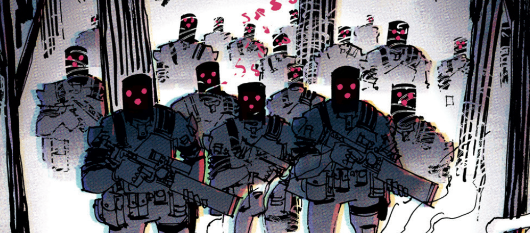
The title character Thumbs is out of his coma, and he’s not feeling very well. Trapped into a specific state of living by that which is known only as the Power, his “Mother” AI guides him through a world in which VR junkies are mummified by wires and apparatuses, motorcycle revolutionaries shoot through otherwise vacant vertiginous cityscapes, and kids are told how they need to think in classrooms. Elsewhere Thumbs and his fellow revolutionary continues to run. The Power has sent many soldiers. They always send too many...
The world that Lewis is bringing to the page isn’t anything particularly new. VR junkies and revolution against a totalitarian regime? Dystopia has been there before, and it’ll be there again. What Lewis IS bringing to the page is a certain kind of poetry. There’s a moodiness to it that makes it feel fresh enough to give life to the artwork. The issue is that it’s all so dense and self-involved that it’s not given enough space to assert itself. It’s way too busy being grim and morose to pay too much attention to the reader. This isn’t a bad thing. It’s just weird.
On the weirdly symbolic pseudo-intellectual world that Lewis is bringing to the page is given quite a bit of style by Sherman. The red and black and grey color scheme has made it to the comics page before with artwork that had felt quite distinctly like Sherman’s. (Tardi-Legrand used it to brilliant effect in Roach Killer back in 1992.) The weird semi-chromatic squalor that Lewis is developing here has a resonance all its own as bright reds provide a wonderful sense of depth to vast landscapes. The foreboding sense of a world that is infinitely bigger than one man is brought to the page in garish reds against the shadows. The action of the revolution shoots off the page in quick shocks of action against the cluttered mess of post-modern life. It’s a very distinct vision of the future on a moody impression of dystopia.
The second issue in the series further develops the overall feel if a world gone wrong that might be somewhat close to the world on this side of the page. It’s been a nice couple of issues so far, but so much of what has come across in the first couple of chapters seems to bleed together. The story is going to need to develop in a much more powerful way in the next couple of issues if it is to escape the heavy gravity of its own visual style.


