

G.I. Joe: A Real American Hero #309 // Review
Springfield is a mess. Total war zone. Cybernetic, bio-engineered freak soldiers are engaging in combat. Cobra forces aredoing their best, but it’s no use. They hit them with high-explosive anti-tank weapons, but it’s not even ruining their paint job. All they’re doing is adding to the wreckage and rubble of collateral damage in G.I. Joe: A Real American Hero #309. Veteran writer Larry Hama continues his jaw-droopingly exhaustive tour of duty with the beloved franchise in an issue drawn by Paul Pelletier and inker Tony Kordos. Color adds depth to the action courtesy of Francesco Segala.
Cobra Commander has a lot of experience on the frontlines. He’s also a really good tactician who can think really clearly in the middle of battle. (You might not have gotten that from the old cartoon, but he IS actually really formidable.) So he’s able to find the right weakness and exploit it, which is a bit of a problem for Zartan and the Dreadnoughts. They’re technically working with the cyborgs who are now starting to look a bit vulnerable. It doesn’t help matters that there are G.I. Joe units on the field of battle making the chaos all the more...chaotic.

Hama isn’t working on anything too terribly deep here. It’s a simple battler that just happens to be taking place in the town of Springfield. It’s pretty simple stuff. Hama keeps it interesting, though. There’s a fun modulation between all of the different elements at play in the battle and really...that makes all the difference in keeping the battle interesting from cover to cover. There’s a bit of wit haunting the corners of an issue that manages to maintain a certain amount of entertainment as the mess continues to develop in Springfield. War continues to be hell, but Hama keeps it interesting.

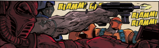
All the clever modulation of action that Hama manages in #309 wouldn’t be much to look at without a decent execution of action on the page. Thankfully, Pelletier finds ways to keep the action interesting as things move around on the page. The backgrounds might not feel terribly distinct, but the action pummels its way across the page well enough to illustrate some of what’s going on. Kordos’ heavy inking feels a bit oppressive in places, but it’s every bit as brutal as it needs to be and never oversteps its bounds so much that Segala can’t add something to the atmosphere with the right shade of dominant color here and there around the edges of everything.

There’s a focus largely on waring factions of villains and the unsavory types here and there. There IS some appeal in the heroes, but they don’t get enough of the center of the panel to feel as interesting as the should be. They ARE the title characters in the series. Every now and then the villains are going to need to show what kind of badasses they are just to add to the menace, but it always feels weird ending an issue of a heroic action series without much in the way of heroism.
Grade: B-


