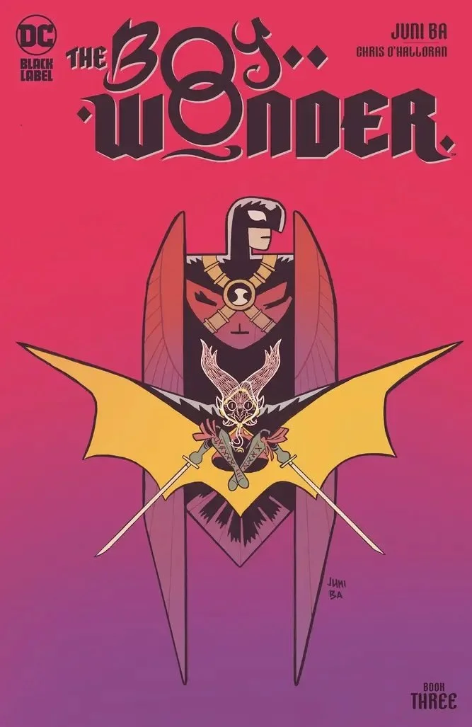
The Boy Wonder #3 // Review
Tim Drake and Damian Wayne are heading off to a big event being held by the mayor of Gotham City. The mayor has a rather strained relationship with the man both Tim and Damian know as their father. They’re about to deal with quite a lot of family drama and quite a lot else in The Boy Wonder #3. Writer/artist Juni Ba delves a bit further into the relationship between Robins in an issue featuring the coloring of Chris O’Halloran.

Tim and Damian are riding In a limo to The Perch. It looks and feels a lot like The Chrysler Building. The main lobby featured larger-than-life statues of the three most famous members of the Justice League. The ominous presence of those massive statues is overshadowed by that which Tim and Damian have come to do. They expect things to get ugly. They expect to be separated. And since they aren’t going to be able to stick together, they’re going to be wearing advanced tech: a pair of invisible headphones that will allow them to stay in constant contact. Y’know...just in case....

Ba’s script is sharp. There’s a strong feeling of tension that gets drawn-up around the edges of the action as the issue opens. There’s a remarkably stylish sense of poise about the pacing that Ba issues in her script. Everything glides along with an even, steady pace that maintains a sense of dramatic weight from one page to the next. The relationship between Tim and Damian is quite clearly developed in detail and nuance throughout the issue. The emotional grounding of the story remains clearly in sight even once the action begins to set-in. By the time that happens, Ba has spent more than enough time establishing what is at stake. It all fits together quite well.

Ba’s art glides across the page when it needs to. It rests ominously in the center of the panel when it needs to as well. And what with it being the case that the author is also the artists here...there's a very strong layout for everything that seems very, very well-balanced. It’s all quite well-executed throughout. Ba breaks-up the drama with some clever, little graphics here and there. The invisible headphones are introduced with a blueprint-style rendering over the Wayne Enterprises logo and a bit of text....like it’s out of some catalog. That rests next to a very dramatic architectural rendering of The Perch complete with a classy, little logo. It all looks so very, very cool. O’Halloran’s color adds to the mood with rich color that never seems anxious to overpower the remarkably strong personality that Ba is bringing to the page.

The fact that both of the lead characters are Robins isn’t really that much of a focus. That’s remarkably refreshing with a title like this that rests so firmly in the shadow of the Batman...Batman who is a cheap ripoff of The Shadow...so it’s fun to see a couple of characters emerge from a popular ripoff and emerge into something sharp, stylish and remarkably clever.r