Knight Terrors: Robin #1 // Review
Babs is checking in on Tim Drake. She’s worried about the fact that he hasn’t been getting enough rest. Maybe he needs to take the night off or something. He asks if Batman took the night off. Of course...they BOTH know the answer to THAT question. And now Babs knows the answer to Tim’s question on the first page of Knight Terrors: Robin #1. Writer Kenny Porter takes Tim Drake through the nightmare of this summer’s big DC crossover with the aid of artist Miguel Mendonca and colorist Adriano Lucas. It’s kind of a fun trip with a guy who knows a thing or two about nightmares, having fought crime on the streets of Gotham City.
Babs switches over to check on Jason Todd. He gives her a chillier reception than she had in her earlier call to Tim. Both of the crime fighters are doing the loner Batman thing. It's understandable given who they both studied under. Of course, fate is going to have to thrust them together as a strange mist enshrouds everything. They are going to take a trip to the realm of nightmares courtesy of this summer’s overpowered villain: a charmingly damaged lunatic named Insomnia.
Porter puts the pair of masked crime fighters through a dreamy haze of an adventure. The overall atmosphere isn't horror so much as it is horror action. But above all else, it's a buddy action comedy with a thin and classy tint of horror. It would be all too easy to let the two mill into each other in the course of the action. Porter keeps the two heroes clear and distinct as they explore a joint realm of both of their nightmares. Tim is more of a detective. Jason’s more of a warrior hunter. The two of them actually work pretty well together in a thoroughly enjoyable tumble through the darkness.
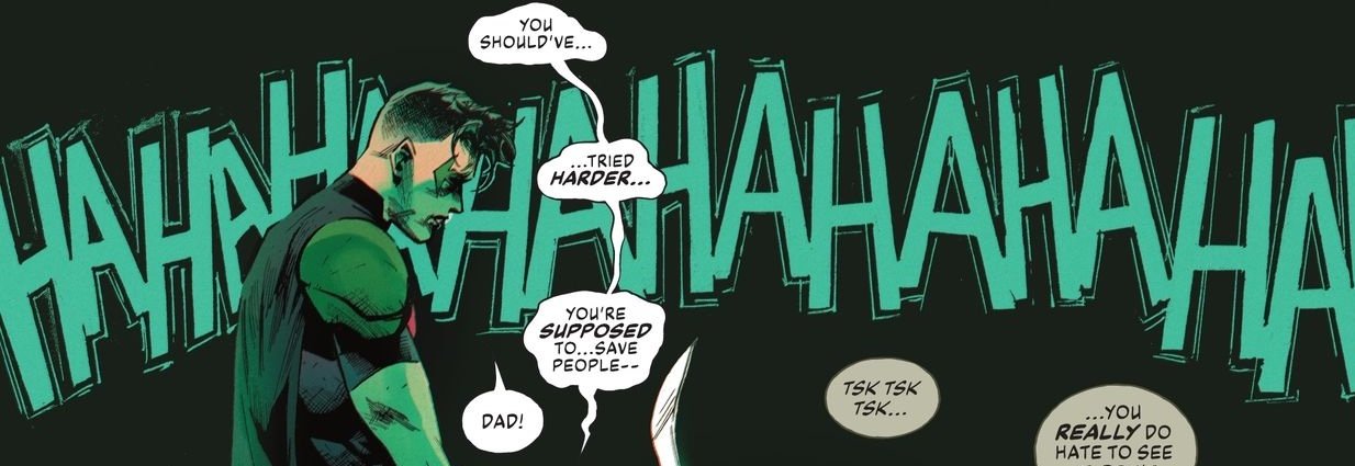
Mendonca and Lucas maintain a crazy energy about the nightmare that still manages to feel very grounded and earthy in a nightmarish urban hellscape. The art team has a tight hold on the visual atmosphere of both heroes. Jason’s scenes are more dramatically angled and kinetically focused on action. Tim’s scenes are more moody and atmospheric and focused on drama. It's a clever alternation between the two, which makes for a dynamic and dramatic pairing. The two contrasting visuals keep the pages turning right up until the end of the issue.
Once the pattern is established, things settle down. And they shouldn't be settling down. Because they need to be tightening up with respect to the drama. It is a lot more fun watching the pattern of the issue establish itself than it is actually watching it play out to its cliffhanger ending. This is really too bad, as the story started out with such a strong and offbeat tone. The surrealism had a powerful connection to the crossover. Porter had been doing such a good job early on. Dual-track psychological action/horror is very difficult and tricky stuff to manage.


