The Warning #8 // Review
Sophisticated military operations break into desperation in the 8th issue of creator/writer/artist Edward Laroche’s The Warning. The alien invasion story aims the better part of 32 pages to resolve a single tactical conflict. The story takes a bit of a breather to allow the action to explode in a visually dynamic issue which covers the aggressive combustion of a crack military squad desperately trying to take down a single target. It’s a brutal, brutal battle with just a slight twinge of the formal military procedure which had so cleverly defined earlier parts of the series.
Operation: All Weather Gladiator Two-Six is engaging a towering beast. It’s been two hours after the Howitzer Orbital attack. Things aren’t looking at all good, but that’s not going to stop a group from trying to take down a giant red demon-looking alien unit. It’s got a death’s head-looking face. There are spikes. There are large whip-like tendrils. This isn’t going to be easy for anyone. It’s going to get really, really ugly for everyone involved. Things might be totally lost, but that doesn’t mean that the military can’t bring down one giant alien mecha that looks like it walked out of some cheesy-looking anime from ten years ago.
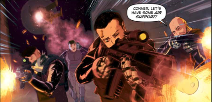
There is probably a lot more going on in this issue than makes it to the page. The opening of the issue DOES have some very classy military-speak that has made the series so distinguished. Sadly, however, it doesn’t take long for the text to move from bits like “We’ve re-established comms with command control,” and “Lensing in red, green filter for optimal optics” to devolve to “Army of one, Motherfucker!” and “Shabbatt [sic] shalom...motherfucker.” (Can I get a “yippee ki-yay motherfucker” as well?) With the series fully launching into Michael Bay Hollywood action movie territory, the dialogue takes a nose dive for the very, very silly.
The good news is that the art is beautiful. Laroche’s handle on high-grade military action is beautiful. As it is an issue-length battle with a giant red demon mecha-thing from space, this issue has NO BUSINESS looking as good as it does. Doubtlessly the explosive action of military versus giant mecha is going to look good on the page, but with Laroche’s art, this thing looks amazing with every panel blown-up to the size of a big screen TV. It’s an issue that plays like a Michael Bay movie...and it actually looks really good blown-up to the scale of a Michael Ba movie, which is pretty impressive.
Presumably the action settles-down a bit from here. (Given the scale of the combat in this issue, it’s kind of difficult to imagine it maintaining this level of action through too many more sustained pages without it feeling annoying and repetitious.) The action in Warning #8 might hamper its sophistication, but it DOES make for a quick, fun bit of action. 32 pages breeze along with blinding speed. It may not be terribly original, but it IS a lot of good, mindless fun.


