Fantastic Four #6 // Review
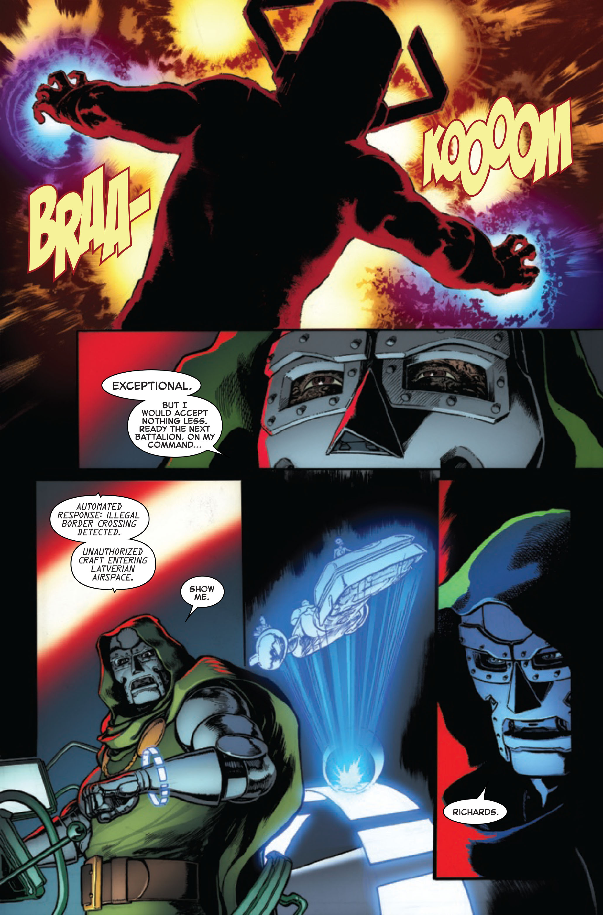
It’s Galactus versus Doom--along with his new Herald--in Fantastic Four #6, written by Dan Slott, with art by Aaron Kuder and color artists Marte Gracia and Erick Arciniega. You read that right: a new Herald of Doom is on the scene, and it might have something to do with why Galactus is on Earth in the first place.
Pulled away from Ben Grimm’s wedding, the newly reformed Fantastic Four head to Latveria to aid Doom, despite his warning that they would face dire consequences for invading Latverian airspace. However, they are met at the border by Doom’s impressive new Herald, whose cosmic power only adds to the mystery of why the World Devourer is on Earth. While Doom’s arrogance seems to get the better of him as he faces off with Galactus, never doubt the machinations of Victor Von Doom.
Dan Slott made a great choice in juxtaposing the previous two issues with this high-stakes tale, making sure not to lose anyone less interested in the low-key and sentimental story of the wedding of Ben Grimm and Alicia Masters. He does find time to present the same heart in a moment with Alicia and her new family, but most of the issue focuses on Doom, and it’s better for it. While some may be bitter over Doom’s return to classic form after his time as the “Infamous” Iron Man, it’s hard not to love Slott’s Doom, especially after the strong cliffhanger ending. However, Slott’s handling of the chemistry with the team rings oddly during a scene with the team dressing on the way to Latveria, which underscores a small but recurring fault with Slott’s choices in approaching the team dynamic. Despite other successes within the issue, the relatively-small problem is so intrinsic to the core of the book that it is hard not to notice.
Aaron Kuder’s Fantastic Four is far more classic-looking that Sara Pichelli’s, even with the new costumes, but that fits the story incredibly well. Kuder is certainly no slouch at making the big moments feel fresh and modern, like his splash page of Doom facing Galactus head-on, but his designs for the characters are pleasantly old-school, especially Doom, who is back in all his green-hooded, metal-armored glory. The color team of Marte Gracia and Erick Arciniega balance this same flavor well, knowing when to make the colors more understated and earth tone, and when to lean into bolder colors, as with the looks of Doom and Galactus. The control of the coloring is masterful, especially the final page’s menacing cliffhanger, which could have been bigger and more garish, but is all the stronger for the choices made.
Slott’s largely-strong start to Fantastic Four continues with an enjoyable, if still flawed, showing, and has found a more idiosyncratic and classic look with Aaron Kuder on board. This book has a lot on its shoulders after the long absence, and this arc will be a big indicator if it can stand up to that pressure. The potential is there, but a lot will come down to the execution of the final issues.


